The Sprague Brand
We all carry the torch.
Greek antiquity meets modern academic institution.

The Victory O
Built around a distinctive “O” monogram and accompanying custom laurel wreath, the Olympian’s identity system returned to Greek antiquity while preserving the look and feel of a modern academic institution. Laurel wreaths trace back to Greek mythology, worn by Apollo, the Greek god of sport. A symbol of victory, worn by champions in athletic competition and poetry. Eventually, laurels were donned by conquering generals in Rome. The primary mark includes the Olympian “O”, carried over from the wordmark, crowned with the laurel wreath: the Victory O.
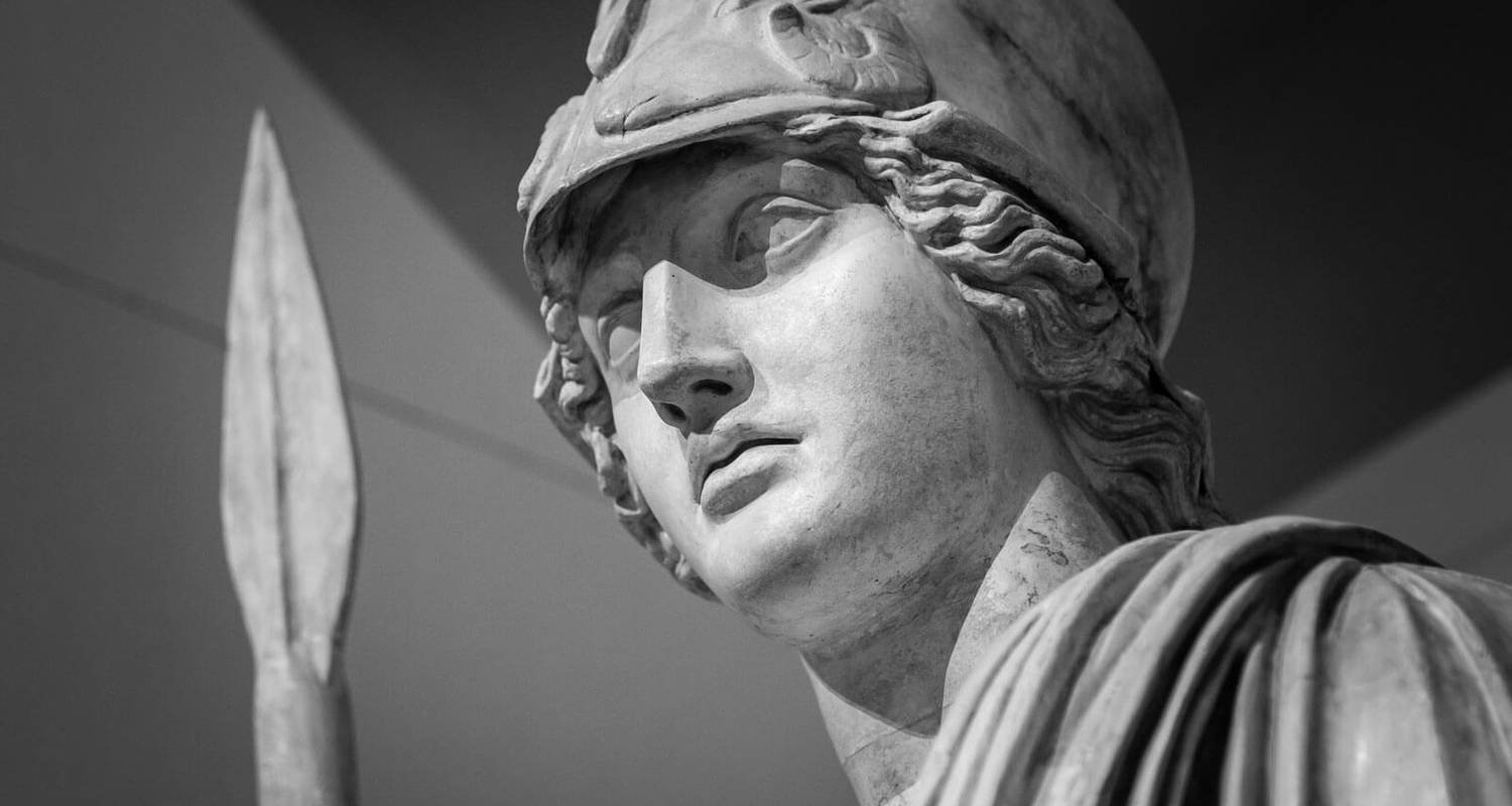

Athena was introduced as a secondary logo to complement our existing visual identity and promote unity and inclusion. In Greek Mythology, Athena represented wisdom, courage, strategy and discipline - values we strive to embody as Sprague Olympians. Athena was chosen to challenge us to look beyond the labels that divide us and instead focus on the label that unites us: We are Olympians. We are Athena.
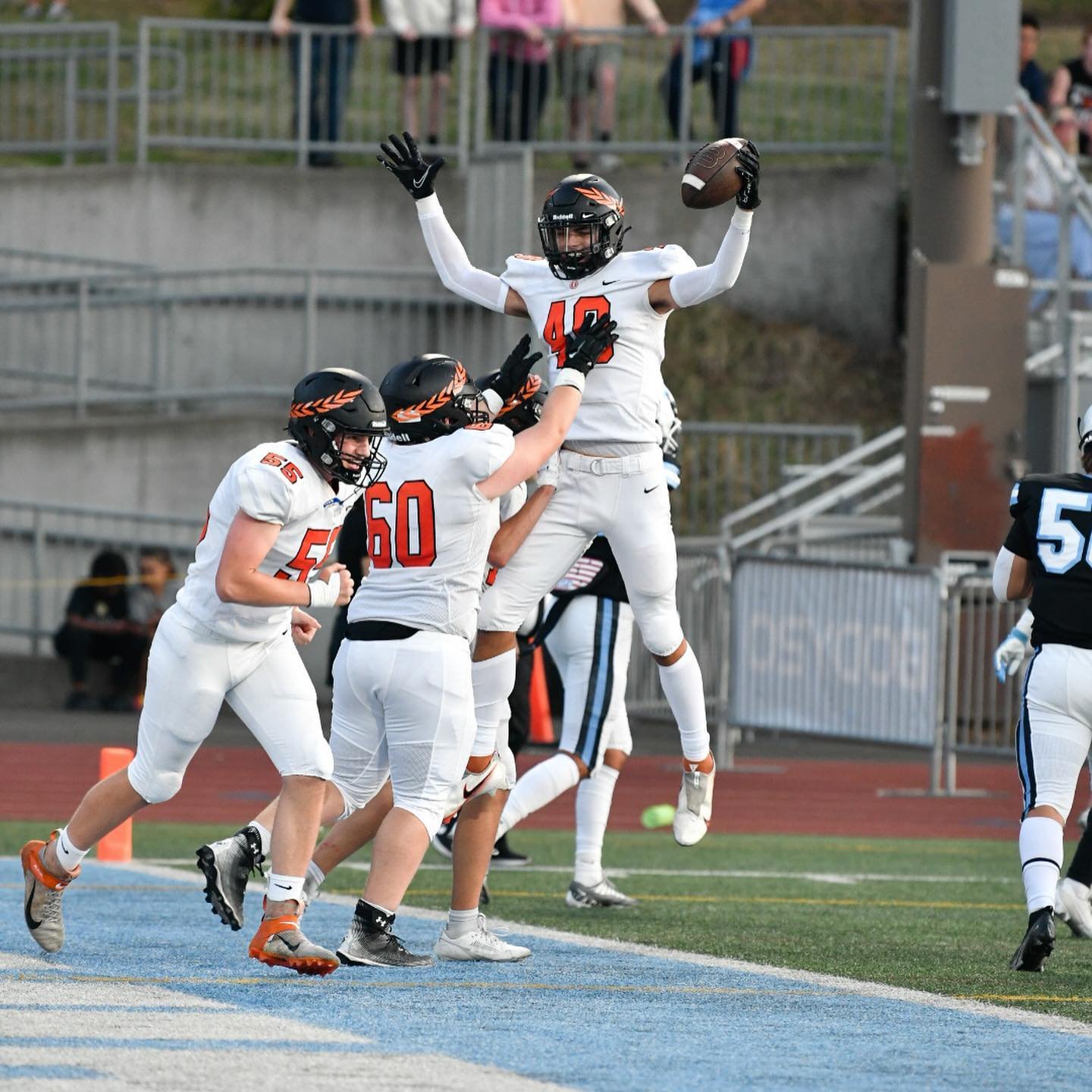
Olympian Orange
Orange, brown, white, gold, yellow, navy blue, black…color confusion has been a long-standing tradition at Sprague. The only color that has transcended every era dating back to 1972 is orange and it is who we are. “Olympian Orange” is our primary brand color with black and white used as accents.

-
![]()
Primary Logo
-
![]()
Primary Academic Mark
-
![]()
Primary Athletics Mark
-
![]()
Secondary Logo
-
![]()
Secondary Academic Mark


Identity
Our visual identity is an important part of the school’s vision for the future, providing a cohesive experience across spatial, digital and promotional communications.